Key Takeaways
- Most carts are abandoned. The average cart abandonment rate is 70.22%.
- Design alone can win many of them back. Better checkout design can lift conversion by 35.26%, which cuts abandonment by roughly 15%.
- Shoppers leave over surprises, not prices. Show the full cost on the cart page, before the checkout starts.
- Do not make shoppers register. One retailer removed the Register button and purchases rose by 45%.
- Put trust where the doubt is. Reassure the shopper next to the card fields, not in the footer.
Learn how minor tweaks in UI can reduce cart abandonment by 15% and increase trust signals during the most critical step of the user journey.
Imagine 100 shoppers put a product in the cart on your store today. On average, 70 of them will leave without paying.
They chose you, they chose the product, and you lost them on the last page.
Most of the reasons are small, and most can be fixed in the design of the checkout flow.
In this guide, I’ll show you why shoppers leave, the psychology behind it, and six small changes that bring them back.
What is a checkout flow?
A checkout flow (or checkout process) is the series of steps a shopper takes from the cart to the order confirmation.
It isn’t just a form. It is the moment the shopper hands over money and personal details, so every doubt they still have shows up here.
The steps of a checkout flow include:
- Cart: The shopper reviews what they are buying and what it costs.
- Details: Who they are and where the order goes.
- Delivery: When it arrives and what delivery costs.
- Payment: Card or wallet details.
- Confirmation: Proof that the order went through.
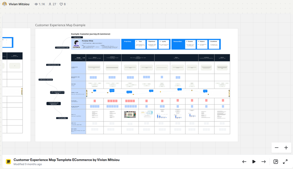
In the template, this is the Purchase stage. The question is why so many shoppers leave at this point.
Why checkout flow is important
The checkout is the most critical step of the journey.
The shopper has already decided to buy, and this is where you can still lose the sale.
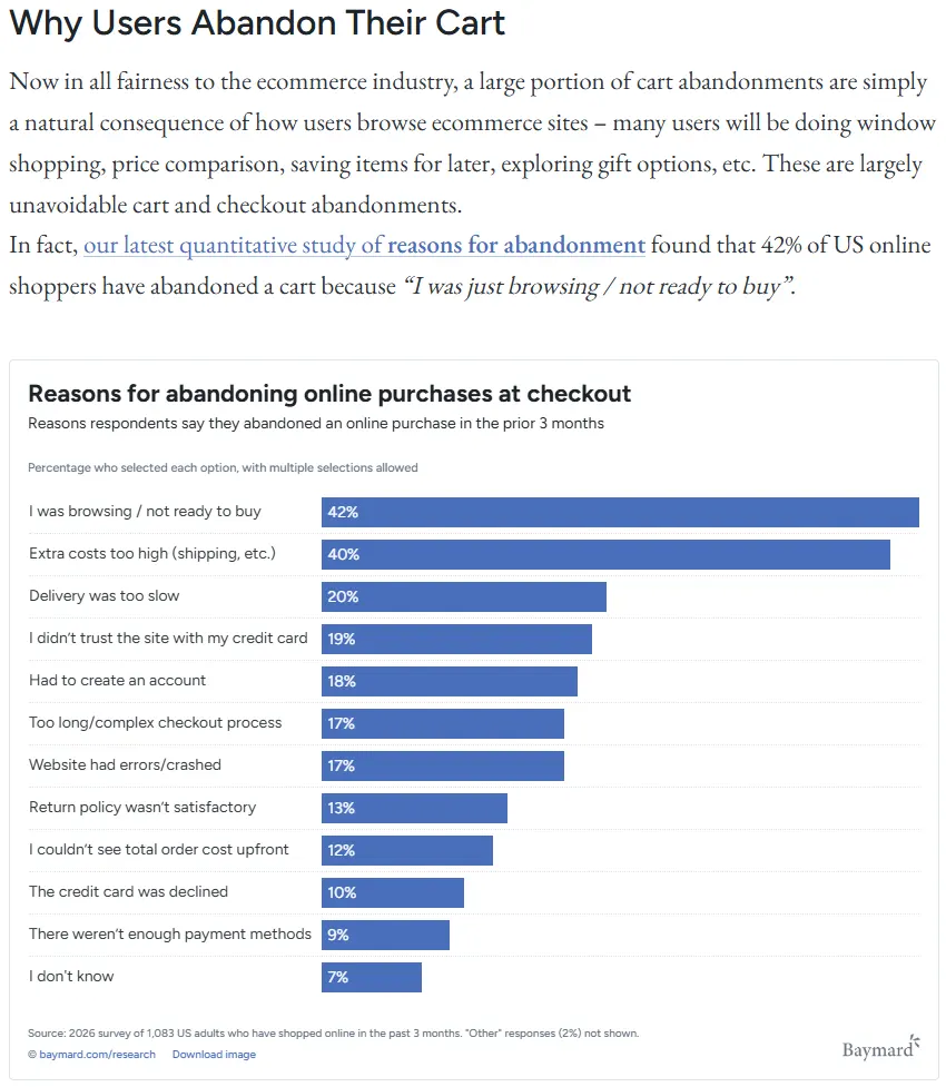
The Baymard Institute puts the average cart abandonment rate at 70.22%, across 50 studies (Baymard). When it asked US shoppers why they abandoned a checkout, these were the answers:
Baymard estimates that a large store can raise its conversion rate by 35.26% through better checkout design alone.
Here is what that means. If 30 of 100 carts are completed today, a 35.26% lift brings you to about 40. Abandonment falls from 70 to about 60 in every 100 carts. That is a reduction of roughly 15%.
Let’s look at four reasons this works, and the psychology behind each.
1. A surprise cost feels like a loss
A shopper decides to buy at one price. If the price goes up after that decision, it feels like losing money, even when the amount is small. In cognitive science and behavior economics this is called loss aversion: losing $22 hurts more than saving $22 pleases.
Imagine this: A shopper sees a coat for $240 on the product page. At payment, the total is $262, because delivery and tax were added. The coat is the same. But they agreed to $240, so the extra $22 feels taken from them.
What it means for your checkout. Extra cost is one of the main reasons shoppers give for leaving: 40% in the chart above. If you cannot avoid the extra costs, make it clear in advance with a warning or a microcopy in the product page. Expectations matter. If they expect extra costs, the feeling is different.
The price did not lose the sale. The surprise did.
2. Every field is a decision
Every field is a small task: stop, think, type. Each task is a moment where the shopper can get tired, make a mistake or be interrupted.
Baymard found that the average US checkout shows 23.48 form elements by default. A good one needs 12 to 14. So the average store asks for almost twice as much as it needs.
What it means for your checkout. Close to half of that typing does nothing for the order. Every field you remove is one less place to lose the shopper.
3. Being forced to commit makes people leave
A shopper at the checkout wants one thing: to buy. An account is a commitment she did not come for. If you make it a condition, some shoppers walk away from the purchase, not only from the account.
Jared Spool tells the story of a major retailer whose checkout began with a login form: two fields, a Login button and a Register button. First-time shoppers did not want to register. One of them said: “I’m not here to be in a relationship. I just want to buy something.”
The designers replaced the Register button with a Continue button. Beside it, they added a short message telling shoppers they could buy without creating an account. Purchases rose by 45%. The first year brought in an extra $300 million (Spool, “The $300 Million Button”).
What it means for your checkout. The change was one button and one sentence. That is how much the forced account had been costing. Let shoppers buy as guests, and offer the account after the order.
4. Trust is decided at the payment field
Typing card details is the moment of highest risk for the shopper. If anything on the page make them doubt the store, they stop. In the chart above, 19% left because they did not trust the site with their card.
In eCommerce Experience Design, trust has three layers. Each one can break at the payment step:
- Technical: The page loads slowly or shows an error while she types her card number. She wonders if the payment will go through twice, or not at all.
- Visual: The payment page looks different from the rest of the store. She wonders if she is still on the same site.
- Emotional: She cannot see the returns policy or a way to contact you. She wonders what happens if something goes wrong.
What it means for your checkout. Answer each doubt where it appears: a fast page, a familiar look, and the returns line and contact details next to the card fields.
Two real checkouts, side by side
The four reasons above describe what makes most shoppers leave. Now look at two real stores that made opposite choices.
At the time of writing, I went through two checkouts as a shopper: a $1,080 watch at Philipp Plein and a $108 travel tote at BÉIS.
Philipp Plein: three pages, and a total that grows.
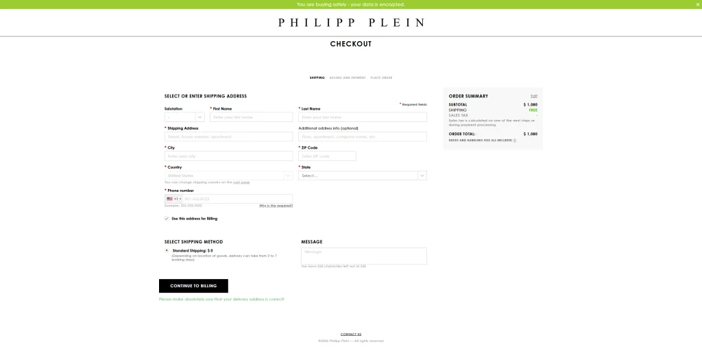
The product page shows $1,080, “Free shipping” and “Duties and handling fees all included.” The first checkout page still shows a total of $1,080, with a small note that sales tax is calculated later.
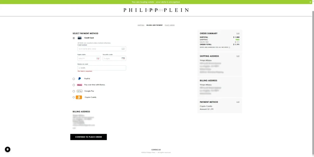
On the second page, $111 in sales tax appears. The total is now $1,191.
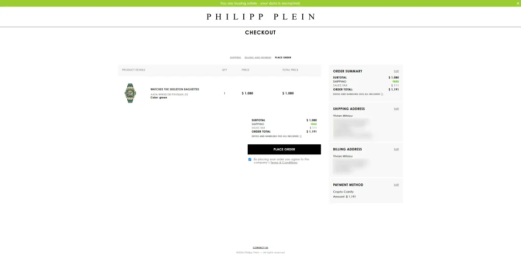
The third page shows the same total once more, above the Place Order button.
BÉIS: one page.
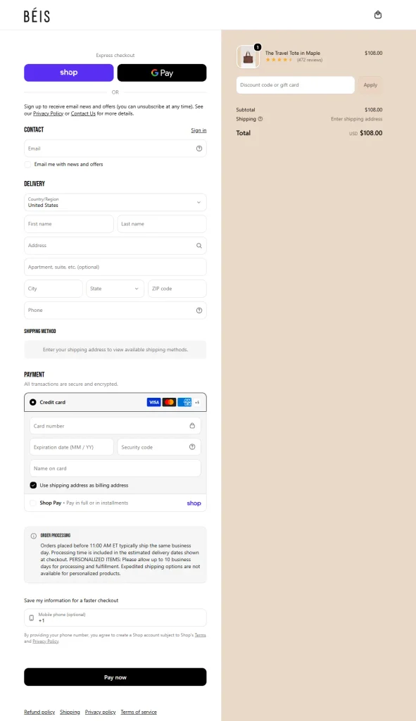
This is a default Shopify checkout page. Contact, delivery and payment sit on a single page. Shop Pay and Google Pay are at the top, for shoppers who want to skip the form.
| Philipp Plein | BÉIS | |
| Product | Watch, $1,080 | Travel tote, $108 |
| Pages | Three: Shipping, Billing and Payment, Place Order | One |
| Total when checkout starts | $1,080 | $108.00 |
| Cost still to come | $111 sales tax, on the second page | Shipping, shown as “Enter shipping address” on the same page |
| Express payment | PayPal and Google Pay, on the second page | Shop Pay and Google Pay, at the top |
| Trust signals | A banner: “You are buying safely – your data is encrypted.” | “All transactions are secure and encrypted,” card logos, a padlock in the card field |
| Details to fill in | About 14 | About 14 |
BÉIS runs on Shopify, so its checkout is one page and as simple as it can be.
Philipp Plein does what many will call wrong: three pages, a cost that appears after you are already in the checkout, and more “obstacles” on the way to the order.
But it isn’t wrong. Not for them.
From the outside, we can never know the reason behind a decision. In the US, sales tax depends on the delivery address, which is one reason it can show up late.
But suppose the reason is this: their products are certainly not for everyone, and they want to keep shoppers who are not certain from placing an order. Then every extra step does its job, and the decision becomes the right one.
This is the reason the “why” matters.
There are thousands of tactics, and all of them are right for someone. None of them is right for everyone. The goal behind a decision matters more than any “best practice”, more than what went viral, and more than what competitors do.
Intention is profitable. Random practices are not.
So before you copy either checkout, ask what yours is for. If your goal is to let every shopper who wants to buy do so, keep it simple and free of surprising costs.
Now that you understand why shoppers leave, let’s examine the components of a checkout flow that keeps them.
What are the components of a high-trust checkout flow?
A high-trust checkout flow is built from six small changes. None of them needs a redesign.
To make them concrete, follow one shopper through all six. She has a $240 coat in her cart.
1. The full price, early
Show delivery, tax and fees before the checkout starts, so the total never grows.
In our example: The cart page already says “Total $262, including $22 delivery and tax.” The number does not change again.
2. Guest checkout
Let the shopper buy without creating an account. Offer the account after the order, when saying yes costs her nothing.
In our example: She sees one button: “Continue as guest.” On the confirmation page, she can save her details with one click.
3. Fewer fields
Ask only for what you need to deliver the order. Put optional fields behind a link.
In our example: One “Full name” field, an address that completes itself as she types, and “Add company name” as a link. She fills in 8 fields, not 15.
4. A progress indicator
Show how many steps there are and which one she is on. People move faster when they can see the end.
In our example: “Delivery, Payment, Review” sits at the top of the page, with Delivery already ticked.
5. Trust signals at the payment field
A trust signal is anything that tells the shopper it is safe to continue. Put it where the doubt is: next to the card fields, not in the footer.
In our example: The card fields sit in a framed box with a padlock and the words “Secure payment.” Under the button she reads: “Free returns within 30 days. Delivery by Thursday.”
6. A confirmation that ends well
People judge an experience by its best moment and its last one. In a checkout, the last moment is the confirmation page.
In our example: She sees her order number, the delivery date and a short thank-you. She knows it worked, and she knows what happens next.
Change one thing at a time, and compare how many shoppers complete the checkout before and after.
FAQs
We use our platform's standard checkout. Can we change anything?
Usually, yes. Even when the payment page is fixed, you control what comes before it: the cart page, the delivery and returns wording, and whether the full price is shown early.
Will guest checkout cost us customer data?
No. You still receive the email and the address with the order. You only stop asking for a password before the shopper has bought anything.
Will trust signals cheapen a premium brand?
A trust signal does not have to be a badge. A clear returns line, a delivery date and a way to reach you do the same job in your own design.
How do we know it worked?
Track one number: orders divided by checkouts started. Change one thing, wait until you have enough orders to compare, and look again.
Final Thoughts
By the time a shopper reaches your checkout, the hard work is done. They chose you.
Decide what your checkout is for before you decide how it looks. For most stores, that means removing the surprises, the extra fields and the doubts that undo a decision the shopper has already made.
Start with one change. Show the full price on the cart page, and measure what happens.
You need a free Wieldex account to leave a comment.